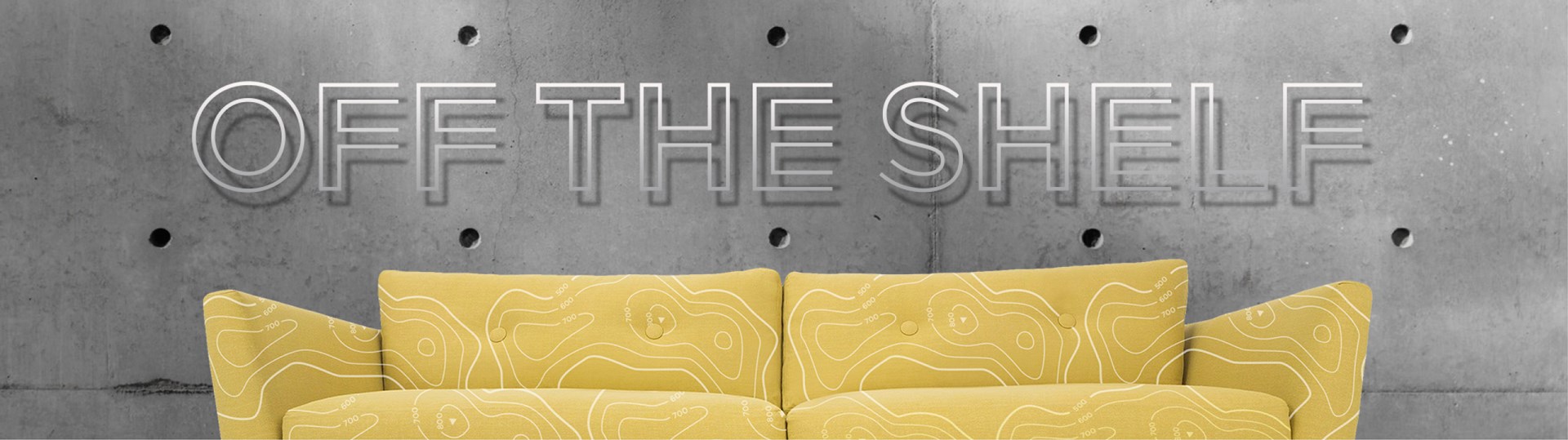
How we turned a fixer-upper into a valuable brand? Anyone who has ever bought or even rented a property is familiar with the term "fixer upper". Like an old house, a company's brand identity, if indeed they ever had one, decays with time - gutters fall off, paint peels, styles change... Anyone who has ever bought or even rented a property is familiar with the term "fixer upper". Like an old house, a company's brand identity, if indeed they ever had one, decays with time - gutters fall off, paint peels, styles change - but while management is taking care of whatever they do best, they are usually too busy to notice or do anything about it, often so much time has elapsed that they do not know where to start. In the case of our Namibian clients NEO paints, their packaging had evolved piecemeal over the course of 50 years - no two label styles were alike and nothing about the company was synonymous with their core brand promise - Namibian paint for Namibian conditions. How we turned a "fixer-upper" into a brandWhat we did: - Identify that packaging and in-store were the ideal vehicles by means of which to reposition the brand name.
- Assess 200 product lines, including all volumes [20l, 5l, 1l , 500ml tins and plastic buckets, as well as all labels.
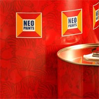
- Convert a plain white bucket with wraparound branding to reflect a more contemporary decorator-friendly design while retaining the recognisability and appeal of the packaging for the existing customer base - consisting of primarily loyal building contractors.
- Applied brand architecture to the reclassification of 200 product lines with more educational labels that help simplify the purchase process of a complicated and information intensive category
- Add strong iconography and logical shelf display strategies to ensure ease of purchase even in vernacular languages
Fears that sales figures might take an initial dip among loyal customers after the packaging change were not realised, as the launch of the new packaging saw a 20-25% increase in sales from the word go, and which it has manage to grow year on year market share to date. Consistent brand care, management and implementation- NOTE: We believe great graphic design thinking renders research irrelevant - no market research was or has ever been undertaken by this brand and yet they have achieved annual double figure YOY growth, even under flat, saturated market conditions. This is achieved by devoted brand care, management and system implementation.
<<Back
|