If the same principles were applied to the renovation of heritage brand marks as heritage landmarks, what criteria could be used to evaluate them?
Firstly, it would need to be acknowledged that heritage brands are publicly accountable. Apart from the direct custom and association of millions of members of the public, their brand presence has shaped both private and public environments from living room television interfaces to the malls and high streets in which people have lived, worked and played alongside a brand’s iconography for decades. In addition, the success or failure of brands affects shared economies and employment. As such, there should be the same responsibility to public interest when repositioning brands, if not more so than for heritage buildings. After all, heritage brands are copied and pasted thousands of times across cities and towns and this is the type of impact assessment that could need to be taken into account.
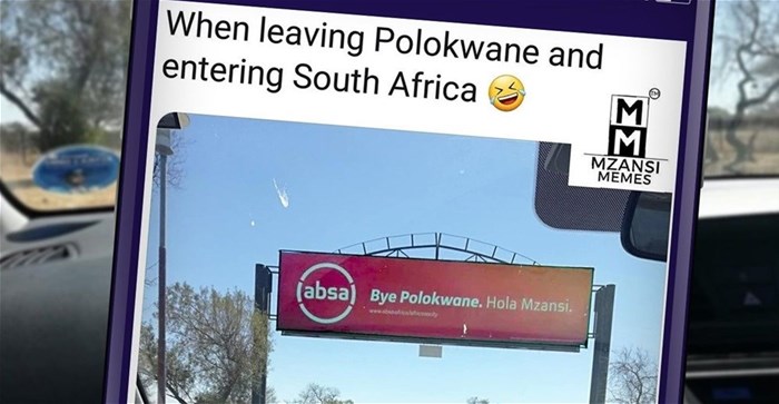
The public outcries when organisations such as the City of Cape Town, Absa (yes, it’s lowercase now) or Pick n Pay rebrand are indicative that the person in the street knows that the necessary impact assessments of their exposure and relationships to the brands in question, at some level, have not adequately been considered.
So the first step when embarking on the makeover of a heritage brand would be to assess the legacy and relational values via a forensic inventory of heritage and relevance. Rummaging through archival material for clues will provide pointers to historical character and features worth incorporating into future brand incarnations.
Everyone that has ever been associated with or exposed to the mark, whether via advertising, signage, trade exchange or employ, is a stakeholder with a vested interest.
Underlying this key insight is that whether they are aware of it or not, customers, other stakeholders and the general public hold emotional relationships with landmark brands that may go back generations and continue for generations to come. For example, customers may be loyal to a brand mark historically, because their parents or even grandparents were, too.
It is one thing to sit in a boardroom with senior stakeholders evaluating the shift in a logo design from before to after and deeming it pleasant enough to be signed off, it is another taking considering an entire country as a user interface, which is in fact the reality!
With the above criteria in mind, would it be possible to objectively evaluate the redesign of brand marks as ubiquitous and beloved as Pick n Pay or Absa, to which the average citizen has arguably been exposed more frequently than the national flag?
Most often, the reason any rebrand is undertaken is because the existing one has become unwieldy, with too many moving parts, difficult to reproduce, understandably dated or irrelevant for the times. What techniques should be used to modernise a corporate identity, whilst still preserving intangible values such as emotional relationships, stakeholdership and perhaps even some innate charm held in the legacy mark?
Without the initial brand forensics, it is difficult to produce an authentic migrate. For example, an inventory of the Pick n Pay brand would reveal the millions of staff members, customers and suppliers whose feet had crossed its turnstiles. Analysing this further would be key to deriving a brand truth - that a couple of generations of South Africans have exchanged earnings for the nourishment and wellbeing of their families via Pick n Pay’s services. These stakeholders could be said to have literally imbibed the brand. Which brings up another factor, a sort of unspoken nostalgia held in heritage brands - Sunday lunch, mom’s chicken a la king, the red-checked blanket used for family picnics, etc - are profound, non-verbal associations, the essence of which should be able to be transposed from an old, unwieldy identity into a new one.
One route to achieving this is known in graphic design terminology as JVD or Just Visible Difference, a useful technique for the process of hand-holding stakeholders through the changes to their favourite brands so as to modernise with minimal impact on brand recognition. While Pick n Pay could be credited as having used some JVD principles in their brand update, the same cannot be said for the City of Cape Town, whose 2014 rebrand was less like hand-holding and more like being rapped over the knuckles.
One could argue that Pick n Pay took it too far, that there were a few missed opportunities which might have succeeded in carrying some of the intrinsic emotional associations over to the new Pick n Pay identity. Graphically, homage could have been paid to the distinctive slab serif ‘P’s, which are really the entire substance of the name as well as the (in this author’s opinion, sadly overlooked) apostrophe of the ‘n - which apart from its innate heritage value, would have been a nod to the South African-ness of the brand, which the UK company tasked with the migrate could not have been expected to know.
Subtly alluding to the above distinctive features might have communicated to stakeholders, even at a subliminal level, that the significance of the brand in their lives and lifestyles has been noted, that their decades of invaluable customer loyalty - that picnic blanket vibe - had been acknowledged and, like the best landmark renovations, preserved in the modernisation for future generations to enjoy.
Perhaps the above musings show that it is one thing to have the the payoff line ‘Inspired by You’, it is another to demonstrate the responsibility and custodianship of whole neighbourhoods and livelihoods affected by omnipresent, oversized brand signage and collateral.
As it turns out, the fact that Pick n Pay’s entire return on their 2007 rebrand was for a font called Cachet - barely crafted a pixel beyond its incarnation as might be revealed by a poke of the keyboard, seems a missed opportunity, which we will likely have to live with in perpetuity.
Which brings us to a similar example, which in its high-street heritage and ubiquity status, should demonstrate the same principles of public interest.
How, you might ask, with every opportunity to draw on the depths of heritage and experience in the global financial sector, a brand like Absa ended up with almost exactly the same font as Pick n Pay, is one of life’s great mysteries. Look at the ‘a’ and tell me that’s not Cachet.
Which just goes to show that to differentiate, evaluate and extract the essential character of a brand that people will buy into, the groundwork should be done on the ground and not in the studio or at a whiteboard.
According to a press release at the time, Absa’s Head of Group Marketing is quoted as saying that three agencies were consulted on the July 2018 Absa Bank rebrand. That not one of them noticed that the future of a globally scalable empire, sprung from the heartland of Johannesburg’s equivalent of Wall Street, would be hinged on a font barely discernible from a 40-year old family grocer, seems inconceivable.
When there is public outcry after rebranding, it is usually because the public senses an aspect of their relationship with a brand has been damaged or done a disservice, that goes beyond subjective opinion about likeability.
Personally, I absa-lutely hate the the fact that a proud Pan-African financial institution had been hung on letters that look like they come out of ‘My First Reader’, but that is subjective.
More considered arguments are stakeholder-vested interests and expense, future economic potential, growth, job creation, investment and other opportunities from which we would all benefit. So while you might argue that it doesn’t really matter whether a logo is a vacant circle or a rounded square, as designers and marketers we are partners in the business of creating and preserving the economic empires and fortunes of our region for the future.
A logo mark is the core from which every other aspect of the company and brand will radiate out into societies. If you don’t get it right at the start, it will be very difficult to imbue organisations with the necessary authentic culture and ethos in future. Corporate identities and the principles that they represent are what make great brand marks and great regions, great.
Thus every person in South Africa and Africa is an indirect beneficiary of decisions made by our nationally present brands and irresponsible, ill-considered decisions affect us all, not only aesthetically but economically. Design matters. We cannot post-rationalise our economic woes on state capture, Guptas or fortify ourselves against economic pillage if our marketing departments make us look like we are up for the taking to boot. When everyone is looking to Africa with faith and hope, we have the responsibility to leapfrog mediocrity and set benchmarks, we deserve that!
Unwieldy, neglected corporate identities are no foundation on which to build legacies. Yet every care must be taken to preserve and retain the relationship that stakeholders have with existing marks, by applying a systematic approach to sharpening, polishing and extracting value rather than demolishing equity, which may be lost forever.
BIO
Off the Shelf Marketing are pan-African BRAND TURN AROUND and BRAND POSITIONING specialists. Specialising in the CURATION and CUSTODIANSHIP of HERITAGE BRANDS to market leadership position. Adding more HEROES and ZEROS to brand value.
www.offtheshelf.co.za | @off_the_shelf_branding | @terrylevin | +27 83 6583344 https://www.facebook.com/offtheshelfmarketing/ https://www.bizcommunity.com/PressOffice/offtheshelf